
If you haven’t seen my logo design project for this cafe yet, please do go check that out.
This project was to create the cafe menu.
Specifications:
- Create an A4 size design – in both portrait and landscape orientation
- Design it in PowerPoint so she could modify the menu herself later – and also use a projector or screen to display it in the cafe
- Try to make nice background patterns or designs
That was it.
So, based on those specifications and the previous logo design and brand colors I’d come up with, I got to thinking about it.
Inspiration
I initially began searching Google for some images of cafe menus and found some pretty good ones.


I started looking at the Pizza Hut and McDonald’s menus because the color scheme is similar (red, gold, black, and white). But I also particularly liked the coffee designs and “homemade” feeling of these other three menus.
No pictures of coffee. Only logo is fine.
Hmm, OK, how to make this interesting?
Eureka!
One day as I was getting ready to take the recycling out, I noticed the following brochure in the garbage from a conference my wife had attended earlier in the year. Wow! The color scheme is nearly identical and the layout, design, and symbols are great! I decided to use this design as inspiration for the menus.


Menu Design 1

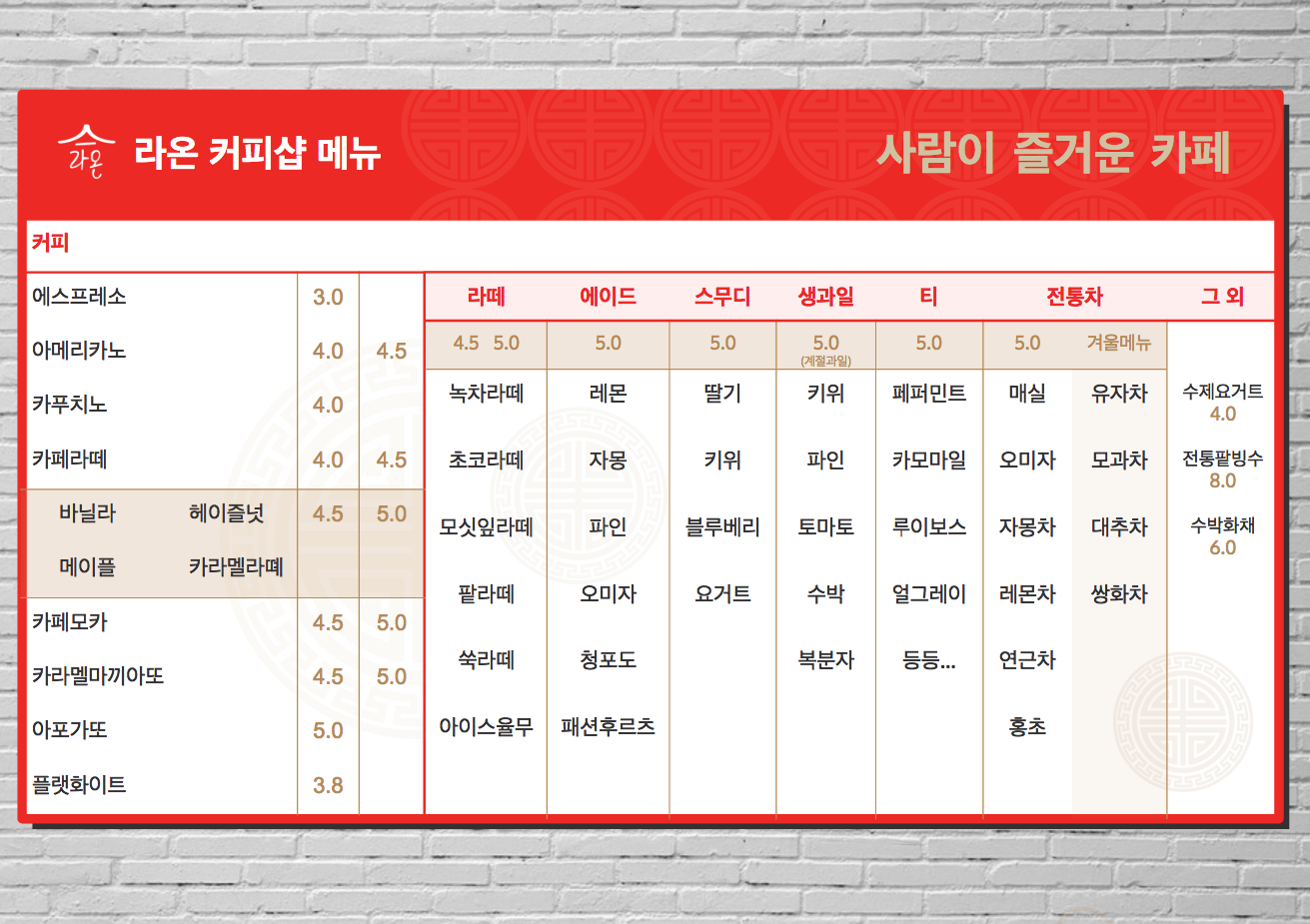
Luckily, I had already drawn the circular Korean icons years earlier for my grad school work so I used a number of those in the designs above.

But it turns out I didn’t need those as the client wanted something much simpler.
The following is a menu example I was sent after making these designs as well as the first menu example sent when I first made the logo:


Menu Design 2
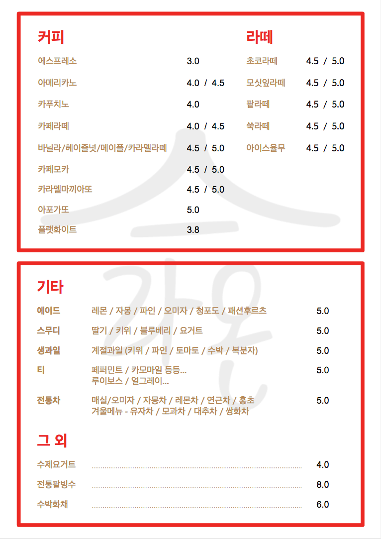
So, I simplified the design.
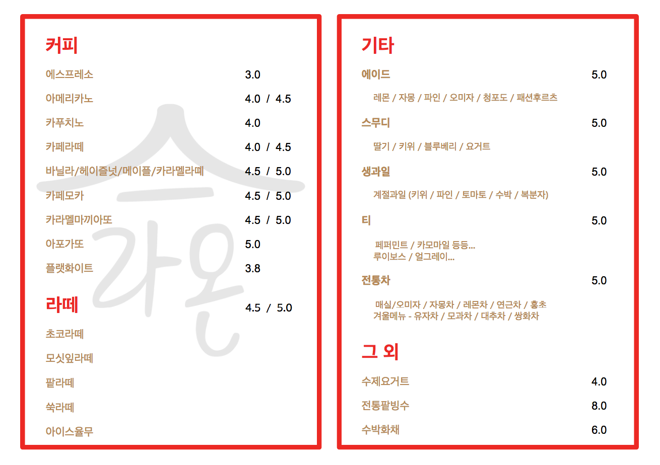
Menu Design 3
She liked the second design, but wanted me to fix some of the spacing, add a few new items and features, and show her it in black, too. She also chose a special font for the menu that I was unable to open in my Mac, so I did the following work on my Windows 10 machine.
The font in question is 문체부 쓰기 정체. I found it online at SejongKorea.org under the menu listings:
- SejongKorea.org > 한국글꼴개발연구원 > 글꼴자료실 > 문화체육부 개발글자체(쓰기 정체)
It looks like it is included in the very popular Hancom Office suite (which is Korea’s own version of Microsoft Office and the one they prefer to use over MS Office).
The problem with the font was that it produced a number of fatal errors when I opened it to install it. I tried to follow the advice of this post which was basically “Open with a Font Editor like Type, then Save As… the same font again.” I also tried multiple font conversion programs online (to change from TTF to OTF) but none of them worked. So, I just used my Windows 10 machine which has Hancom Office (and the font) on it.


Note: All of the above designs were made in PPT (actually, Google Slides). It shows you just how powerful those programs can be.