One of my friends recently opened up his own Psychiatry clinic after working in a large hospital for a number of years. He’d thought my design work for Antioch Church was quite good so asked me to make him a logo.
Additionally, from my experience with Korean design firms, they tend to try to make designs as quickly and efficiently as possible – often to the detriment of the actual visual message the client wishes to express. Such was the case here as well as the first options the design firm presented for the Lodem Heal logo were nothing like what the client was hoping for.
Project Brief
I received a phone call one Friday night asking for my help to (quickly) design a logo to be used to brand the new clinic. They wanted to print (everything) banners the next morning. I was given 3 stipulations:
- Project needed to be finished by 9am Saturday (almost 12 hours later)
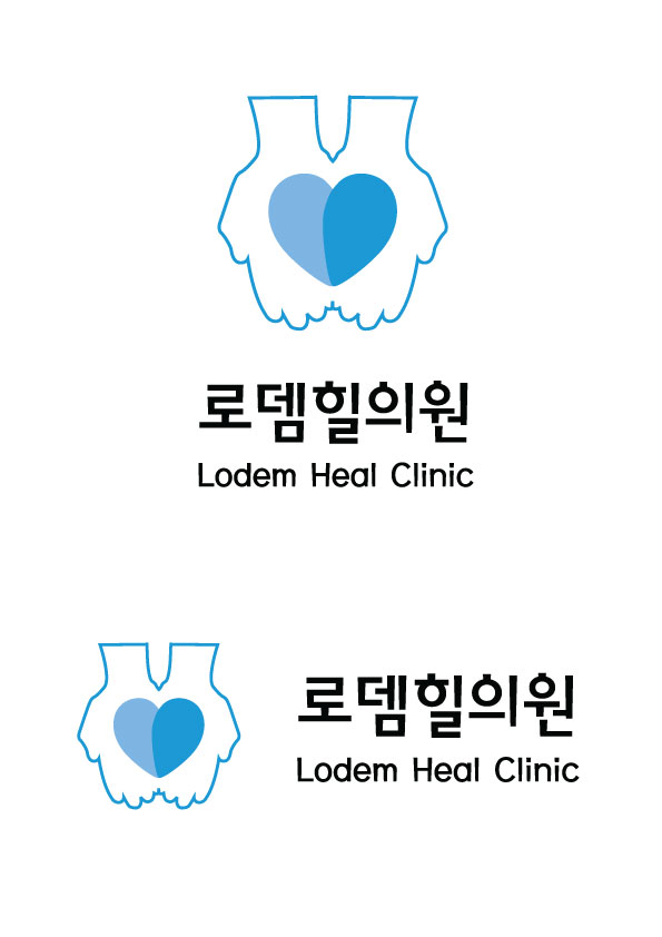
- The logo must be in blue and contain 2 (meaningful) elements:
- A broken heart that was being mended
- Two hands cupping the heart
- I needed to also design a location map to be used on the business cards
Apparently, the imagery (and clinic name) were taken from 1 Kings 19:5 when the prophet Elijah fled from King Ahab. “He lay down under the [lodem tree] and fell asleep. All at once an angel touched him and said, ‘Get up and eat.'” It was this “divine healing touch” that the client wanted to express through his logo.
Inspiration
I created a moodboard with a number of different cupped hand shapes and started sketching, then playing around with fonts and shapes of my own.


First Concept
Initially, I thought the first concept was the better choice, but the client chose the second. In fact, he liked the second design so much, he immediately had me send the file to the printer without any further changes.
![]()
![]()
Final Designs