
Date & Venue:
Saturday, April 12, 2012
Jeonju University Star Center, Jeonju, Korea
Background:
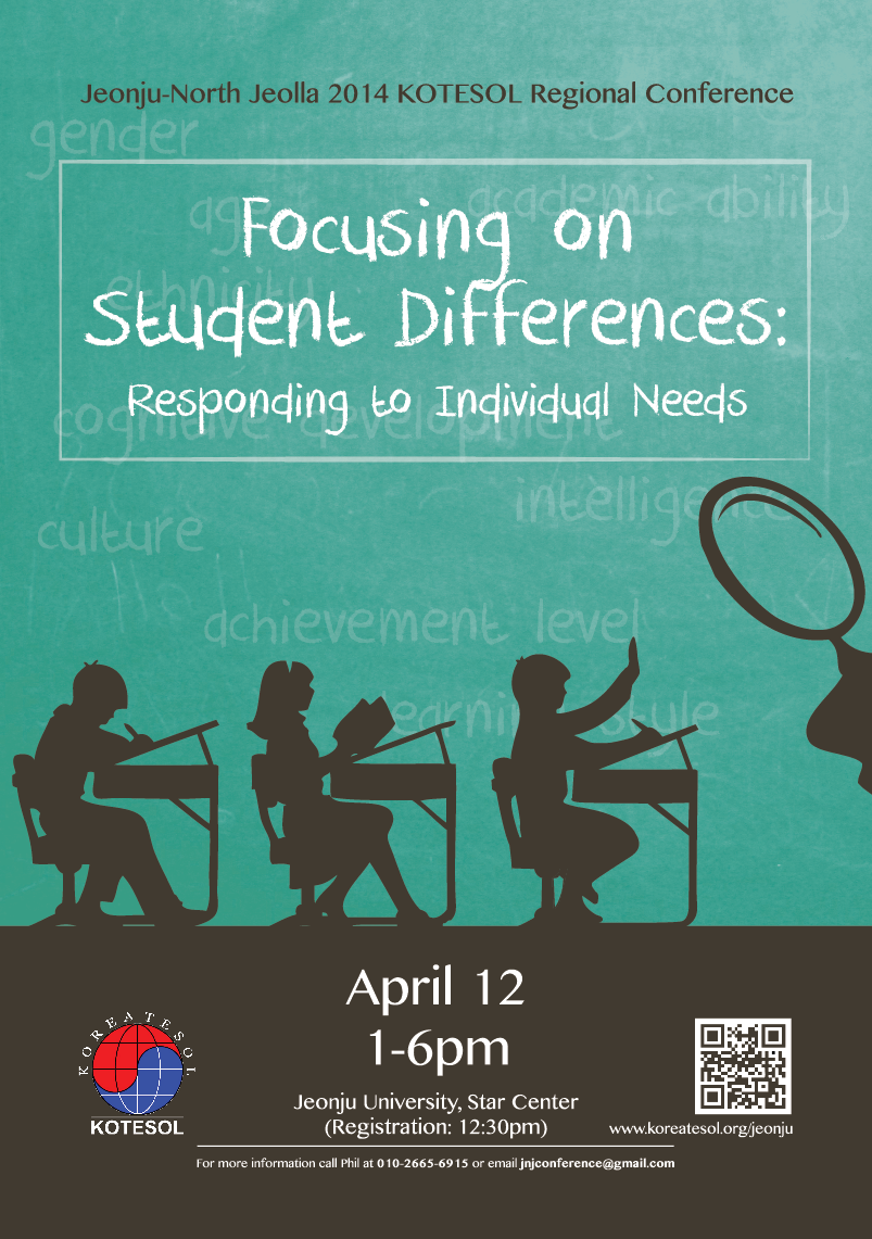
I was given the Conference Theme “Focusing on Student Differences: Responding to Individual Needs” and told that Sherlock was the main topic of discussion among the organizers. They indicated that it might fit with the them well to show Sherlock Holmes as an “investigator” who was focusing on different students’ needs.
Although Benedict Cumberbatch was mentioned, his Sherlock didn’t use the traditional magnifying glass and licensing of a Cumberbatch picture would have likely been a pain, so I decided to go with just a magnifying glass and not any actual picture of Holmes himself (even the traditional one).
I had a number of ideas at first including:
- A photo shoot with a bunch of students in uniforms and a grid-like desk layout (perhaps 3 x 3) – with one student clearly out of uniform.
- A photo of a single student in a desk studying – copied many times over (to look identical) and then a single “different” student.
- I’d thought of doing a grid of students from the front-top as if the viewer were a wall clock looking down on them.
- Or a front row of students – almost like a police line-up with desks.
But eventually, as I was driving through Jeonju one day, I happened to notice a very interesting and simple poster that really caught my eye – especially compared to all the noise of other posters around it. That poster had:
- A very simple two-color design.
- Vector image silhouettes as opposed to actual photographs.
- Simple and clear fonts.
- A clear dividing line separating top from bottom and splitting it into two equal parts.
- The color scheme was green and brown.
- The silhouettes were side views of faces – they looked slightly vintage.
That poster really helped inspire this one.
Design Deliverables
- A2 Poster (pictured above)
- A4-size front designs for the conference book
Version 1
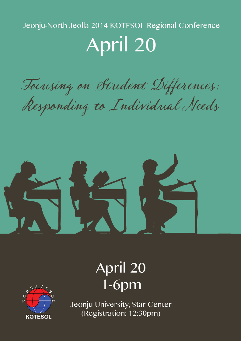
The first poster had no magnifying glass, but the font chosen for the Conference title is Sherlock.
Version 2
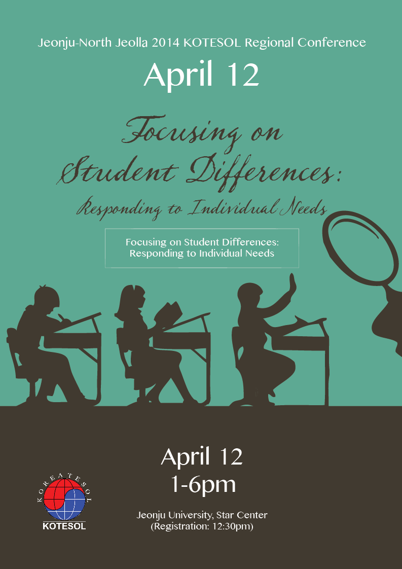
The Sherlock font was thought to be too difficult to read for some people, so I added a second heading in the other poster font: Lao MN.
I was also asked to show a lighter version of the poster.
Version 3

In the final iteration of the poster, I used DK Crayon Crumble as the font and added some “differences” between students. The list is below:
academic ability/intelligence, achievement level, gender, learning style, ethnicity, culture, cognitive development, age